Mobile App Concept Development
Role: UX researcher + designer | MS degree project | Methods: Task analysis, personas, wireframing, prototyping, UI design | Timeline: 3 weeks
Overview
In the fall of 2019, I took part in the AIGA: Chicago Mentorship Program. I used my newly found Proto.io skills to prototype a new mobile upcycling app called Curb Side.
Curb Side is a mobile app that allows users to search, upload, and collect discarded furniture throughout the city. The app is inspired by the countless mountains of discarded furniture I’ve encountered commuting through Chicago and aims to decrease furniture waste by making upcycling easier.
Project Scope
The project was created as an after-hours side project with new unfamiliar prototyping software (Proto.io). The project follows three phases: Research, Ideate, and Prototype
Roles
Research
Ideation
Information Architecture
User Interface Design
Prototyping
Tools
Adobe Illustrator
Sketch
Proto.io
Project Background
In 2017, 12.2 million tons of discarded furniture went to landfills.
As production of low-quality furniture ramps up furniture waste is steadily increasing. There are resources to donate and sell unwanted furniture, but they require more effort than users are willing to give. As a result, leaving unwanted furniture in alleys or curb sides is a common practice.
Upcycling is the process of turning used goods into something new. Upcycling items breathes new life into items, reduces landfill waste, and can even save people money.
In this project, I set out to create a solution to help people find and collect items to upcycle in hope of motivating more people to upcycle and reduce furniture waste.
Project Goals
Give users access to important item information before they travel to the item
Show users items in their area quickly and easily
Simplify the item collection process
Reduce risk of collecting bad items
Increase trustworthiness of collecting upcycle items
Problem Statement
How can I make collecting discarded furniture easier for consumers?
Phase 1: Research
I decided to use a competitive analysis, and secondary internet research for my research.
Chart 1: Competitive Analysis Checklist
Competitive Analysis
Beginning the project, I knew there were already a few other indirect competitors in the problem space. I compared Craigslist, and Offerup based on the cost, mobility, trustworthiness, and features.
Overall, I found both competitors apps are free to install and mobile-friendly. Both apps also have many of the same features and medium to low perception of “perceived trustworthiness” which I learned from online consumer forums.
Research Key Insights
I used the competitive analysis along with a closer inspection of the competitor platforms to pinpoint three main issues that deter users from collecting upcycle items.
1. Gatekeeper user roles create inefficient process flows
After creating a process flow illustrating how users collect items using Craigslist free and OfferUp (Below), I realized both competitor apps followed a similar process.
Chart 2: Competitor process flow
In the competitor process flow, I noticed the “Seller” or “Owner” roles each have distinct affordances and responsibilities. However, categorizing users into these roles creates roadblocks that potentially complicate or stop the process flow altogether.
Complications can arise when “Owner/Sellers” are unresponsive, have unfair pricing, or are perceived to be untrustworthy. Because Curb Side items are free items, these user roles are not necessary. I decided to eliminate the “Owner/Seller”, and “Buyer” roles from the Curb Side process flow altogether. Featuring free discarded items in public spaces allows for a decentralized process structure that lets any passerby quickly pin new items to the map for other users to search through and collect.
Providing a low-entry barrier to posting items also can motivate more people to post and drives upcycling efforts which can have a huge impact on reducing furniture waste.
Chart 3: Proposed solution process flow with eliminated process steps
2. Risks of collecting upcycle items can turn users off to the idea
Another issue I needed to address is the perceived “trustworthiness” of upcycle items. Using information from online consumer forums and my own experience, I minimized two potential risks stopping users from collecting upcycle items:
The risk of a user not seeing or losing sight of an item
To reduce this risk I incorporated organizational features seen in other competitor platforms like a search bar, a map view, an optional list-view, a “favorited items” collection, and the ability to share posted item with friends. All of these features are relatively standard in the realm of e-commerce platforms. Together, they help make Curb Side a stronger competitive in the domain and provide well vetted and familiar solutions to help user see, access, share, and organize the items on Curb Side.
The risk of collecting an item of poor quality
For this, I first added multiple avenues to describe item quality before users are burned by a bad item. I added quantitative and qualitative quality measurements like item photos, item quality ratings (on a 1-5 scale), item descriptions, and user comments to item posts. One of the competitor platforms also included this and it seems to be conducive to a higher perception of trust from users. I felt adding these quality measures was effective for an initial prototype. I would look to future testing to assess the effectiveness of these quality measurements.
3. Collecting upcycle items requires unique information for planning
The third issue that stops users from collecting upcycle items is the simple fact that collecting upcycle items requires planning around different variables. Specifically, knowing the weather forecast is crucial information because an unexpected rainstorm can ruin items if they are not collected beforehand.
I decided to integrate local weather information and real-time weather alerts to remind users to collect favorited items before any bad weather might cause damage. Neither of the competitor apps include a feature like this and I believe giving users access to this information could empower and motivate users to upcycle more.
User Profiles
I modeled two user profiles based on research insights and personal experience interacting with online upcycling communities: university students, budget-minded shoppers, and secondhand furniture business owners. This gave me a better understanding of potential users’ motivations and goals before getting deeper into the design.
"The Opportunist” User
Has collected few upcycle items in the past
Does not seek upcycle items out
Does not believe discarded items are good quality
Only interested in near-perfect condition items
Uses upcycle items to furnish personal home
“The Pro” User
Has collected many upcycle items in the past
Seeks upcycle items out, always on the look out
Sees potential in discarded items
Interested in furniture refurbishing
Uses upcycle items to furnish personal home and sell to others
Phase 2: Ideate
Information Flow
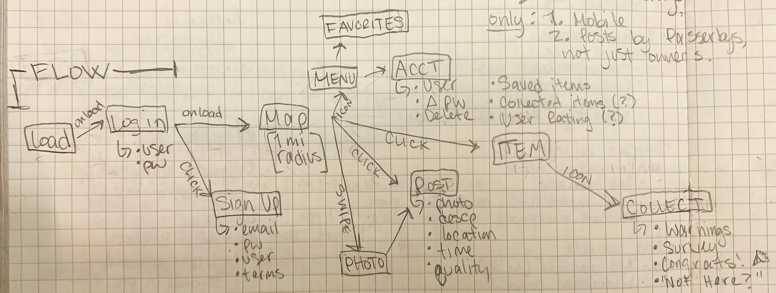
After deciding Curb Side’s general concept and key features I sketched a diagram of the information architecture to flesh out the basic structure of the app.
Starting from a flow sketch helped me efficiently plan how I would start building the prototype. The flow includes some key information gathered, additional secondary pages, as well as in-between page navigation interactions to see how each page fits together.
Image 1: Information architecture sketch with key inter-page interactions
Lo-Fi Wireframe
I continued building the app up by sketching the UI for each of the screens. I kept the same general structure and inter-page interactions, but went further by sketching in which areas of the screen would be interactive.
Image 2: Wireframe sketches with key inter-page interactions
Visual Style
After getting the structure and layout down, I focused on the app’s overall look and feel. I decided on a simple, bright, and cheerful palette with illustrations. Together these choices created a more playful and neighborly feel that makes upcycling feel more trustworthy, approachable, and fun.
Color
I chose a bold orange for the app’s main color palette because it is associated with happiness, creativity, and affordability. Orange also appears youthful which might appeal to frugal-minded university student users who are likely to use the app.
Image 3: Curb Side color palette
Font
Image 4: Title and body fonts
I chose to use Lucida Grande because it keeps in tune with the app’s cheery, approachable, and minimal aesthetic. The font was used for all text on Curb Side in various colors and weights. Using a modern humanist sans serif font also lends itself to easier reading on a smaller mobile screen.
Icons
I also created simple icons, illustrations, and a logo for the app to add a sense of playfulness and approachable identity while still remaining modern. Along with adding some visual interest, the illustrations help Curb Side seem more comfortable, unique, and community focused.
Image 6: Icon sketches
Phase 3: Prototype
Mid-Fi Prototype
Future Steps
If the app were to continue development special attention would go into developing the item search bar and item filtering features. Another detail would be determining the best item quality measurement metrics to include that is easy for users to understand and easy for developers to manipulate as data. Last, the UI and navigation would be elevated for a more seamless experience.
Key Take-Aways
This project was my first time taking part in the AIGA: Chicago Mentorship Program. The program was incredibly valuable, and I highly recommend it to any designers looking to learn more about their craft or expand their network. I really enjoyed getting the incredible crash course on prototyping with Proto.io. Ultimately, I was able to hone my UI skills, experience a professional UX critique session, and walk away with a new tool under my belt.


