Mobile App Heuristic Evaluation & Usability Testing
Role: UX researcher | MS degree project | Methods: Heuristic evaluation, cognitive walkthrough, unmoderated | Timeline: 8 weeks
Project Overview
In this project my team assessed the "Add a Mood" tool within the Sanvello mobile app. We performed an heuristic evaluation, cognitive walkthrough, assessment test, and comparison test and used findings to create and test a redesigned user interface.
Timeline and Process
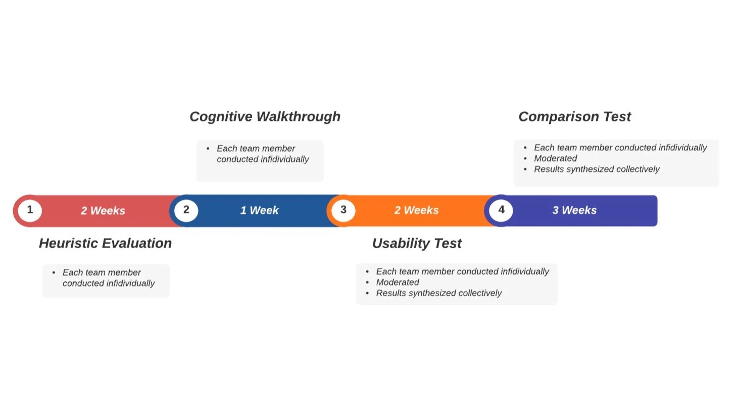
Our team had a total of eight weeks to dedicate to this project.
The weeks were divided between four phases: (1) Heuristic Evaluation, (2) Cognitive Walkthrough, (3) Usability Test, and (4) Comparison Test.
Roles
Test Design
Research
Data Synthesis
User Testing
Tools
Airtable
Axure PR
Validately
Zoom with screen sharing
About the Website
Sanvello is a mobile app that helps users improve their mental health. It provides a toolbox for managing daily stress, anxiety and depression. Includes features like:
Guided meditations
Daily mood tracking
Habit trackers
Stress management information
Community support chat
“Add a Mood” Tool
The Mood tracker is meant to help users track their daily emotional health. Users enter their Moods into the app themselves, by selecting a moods on a positive to negative scale and entering additional more descriptive feelings for context.
If the mood data is inaccurate, users will not get relevant content suggestions and will likely consider the app useless.
Image: Mood Tracker Screens
Project Focus
We focused on the Mood Tracker because “Moods” are the primary user data Sanvello collects. “Moods” are what the app uses to make content suggestions and track overall wellness.
Phase 1: Heuristic Evaluation
We used Nielson’s Usability Heuristics for our heuristic evaluation. During the evaluation we combed through the Sanvello app and catalogued any heuristic violations.
In total we found four heuristic violations with the Mood Tracker tool.
Findings
Image: Mood Tracker Enter a Mood Screen
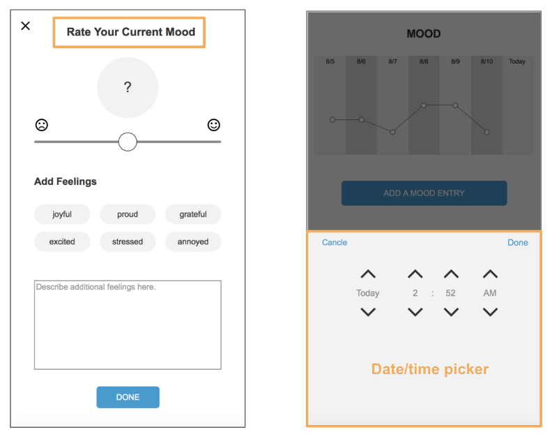
1. Features a circular slider, which is unfamiliar and confusing.
Violates: Consistency & Standards
The Mood Tracker features a circular slider, which is unfamiliar and confusing. Also, the most extreme values like very bad and very good were placed directly next to each other.
Recommendation: Use a simpler rating method, like a horizontal slider, or a variation on the pain scale like images with faces of smiles/frowns.
2. When adding your first "Mood Entry" the "Right Now" link implies it can be pressed but it cannot.
Violates: Consistency & Standards
This implies that the entry times can be pressed to pick a different time. But, when pressed nothing happens.
Recommendation: Remove (v) carrot icon if there are no other choices to pick from than "Right Now".
Image: Mood Tracker Date Picker Screen
3. The time picker displays past dates, but does not allow selection of past dates.
Violates: Consistency & Standards
Recommendation: Eliminate the option of picking past date/times, or expand functionality to allow for greater selection choices.
4. Users cannot edit historical mood entries to correct errors.
Violates: Help users recognize, diagnose, and recover from errors
The app did not allow users to edit past mood entries to correct any errors. Recommendation: Make past entries editable.
Phase 2: Cognitive Walkthrough
In phase 2, we performed a cognitive walkthrough following the process of adding a mood. We found similar issues with the Mood Tracker as the Heuristic Evaluation.
Findings
The main issue we found was the Mood Tracker widget on the Home page was missing a CTA button to add mood altogether. If users click on the widget, they would be directed to the “Add a Mood” page, but the lack of context was confusing and disorienting.
Image: Mood Tracker on Home Screen
Action
[“Home” page] User taps within the “Mood Graph” widget (unlabeled)
Will users try to produce the effect the action has?
NO – There is no reference to the ability to log a mood.
Will users see the control for the action?
NO – The screen is so cluttered and none of the options is especially clear.
Will users recognize the control produces the effect?
NO – Even though a mood graph is present, it is not clear that it should be tapped to add a mood.
Will users understand the feedback?
YES – Tapping the correct area advances to the mood dashboard screen, where the process of entering a mood continues.
User Testing Overview
We conducted two rounds of user testing focusing on the Mood Tracker tool: Usability Test and Comparison Test.
Phase 3: Assessment Usability Test
Assessment Test Overview
We conducted a an assessment usability test in phase three. We have recruited 4 participants and looked at what paths users took to log a mood. We also looked at general user satisfaction, user difficulty, and success/failure rate.
We found that all four participants were able to successfully complete this task, but 3 of the participants took a longer time searching since there was no clear way to log a “Mood” directly on the “Home” page.
We also found that while the mean difficulty rating and user satisfaction were generally acceptable, many participants did not appear very confident they had completed the task correctly, and one participant even noted that they were satisfied with the feature only if it was not a main aspect of the app.
Test Procedure Details
4 participants
Assessment test, Moderated, remote via Validately
All participants used a login created specifically for testing
Objective: To evaluate the ease of use of the “Self Care” features provided by the Sanvello application by asking:
What path do users take to log a “Mood”?
Task: You have just received a call letting you know that you have just won a free weekend getaway from an online raffle. How would you go about recording your current mood in the app?
Assessment Test Findings
When trying to log a “Mood”, most participants attempt to log a mood through the “Home” page “Mood” chart.
After an initial mood entry has been added for the week, the chart displays, but the “Add a mood entry” button no longer displays directly on the “Home” page. This inconsistency was disruptive to participants' ability to complete their task.
Participant Quotes:
P4 [After exploring the “Home” page for an extended amount of time, looking to log a “Mood”]:
"I can just see a graph that is recording my mood, but I don't know how to log that data.".
Image: Mood Tracker with button on Home Screen
Image: Mood Tracker without button on Home Screen
Phase 4: Comparison Test
We used the findings from our assessment usability test to to see to inform a redesign of the Mood Tracker tool. We then conducted a comparison test to determine if our redesigned UI could increase the efficiency of the “Add a Mood” tool.
Comparison Test Overview
In this final phase of our research project, we used a comparison test. In the study, participants were tasked with “adding a mood” using prototypes of the original app design and our redesigned version.
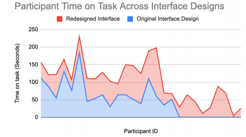
In our results, we found there was no significant difference between the original and redesigned prototypes’ task speed. However, there was a significant difference between the groups’ success/failure rates, which suggests participants who interacted with the redesigned interface were more likely to successfully complete tasks.
This would suggest our redesigned design would improve user's overall ability to successfully log their moods.
Procedure Details
32 participants, within-subject test
Unmoderated, remote via Validately
Objective: Can users efficiently log a mood?
Independent variable: Changes to UI (Original Design vs Redesign)
Dependent variables:
Time on Task
Success/Fail rate
Task: You have just received a call letting you know you have won a free weekend getaway. You are feeling joyful and excited about the news and want to record your emotions in the Sanvello app. How would you go about recording your very good mood in the app?
Table: Comparison Testing Procedure
Comparison Test Results
Time on Task:
Participants using original interface design took 72.22 sec average to complete the task
Participants using redesigned interface took 55.04 sec average to complete the task.
No significant difference between the time on task for the participants with the original interface design (M = 72.22, SD = 39.83) and the participants with the redesigned interface design (M = 55.04, SD = 35.29) at alpha level .05 (t(33.46) = 1.48.14, p = .15).
Success/Failure Rate:
14 out of 32 (44%) participants using original interface design failed to complete the task
5 out of 32 (16%) participants using redesign interface failed to complete the task
We explored if task success/failure rates were associated with the type of interface participants interacted with. We found that the associations were significant, 𝜒2 (1, N = 64) = 6.06, p < .05.
Date/Time Picker:
Requiring users to select a date and time for the entry added to task time.
Circular Slider Mood Entry Widget:
The circular slider is the main tool for recording one’s mood, but it’s operation does not seem to fit the task well. It was a common source of failure because it was unfamiliar to new users, and there are no hints on the screen to explain how to interact with it.
Dropdown Multi-Select “Add Feelings” Widget:
The original interface design requires participants to tap 4 times to complete entering feelings, while it only takes 2 taps on the redesigned prototype. These additional taps also added time to the task.
Final Design Recommendations
The culmination of our research led us to develop four final design recommendations for the “Add a Mood“ tool.
1. Add a Persistent Log Mood Button on “Home” page
Severity: 3; Important to Fix
Altering CTA buttons is disorienting and confusing for users. Also, the Mood Tracker section is not an obvious button. A persistent button would eliminate confusion.
Left: Redesign UI ; Right: Original UI
2. Eliminate the Date/Time Picker
Severity: 4; Imperative to Fix
Instead of showing date/time picker immediately after users have selected the “Add a Mood entry” button, consider automatically taking the current date/time from the device and jump directly to the mood entry page.
Allow users the option of editing entry time/date by including a small “Option” button on the screen that will open a date/time picker for their entry
Left: Redesign UI ; Right: Original UI
3. Redesign the Mood Entry Widget
Severity: 4; Imperative to Fix
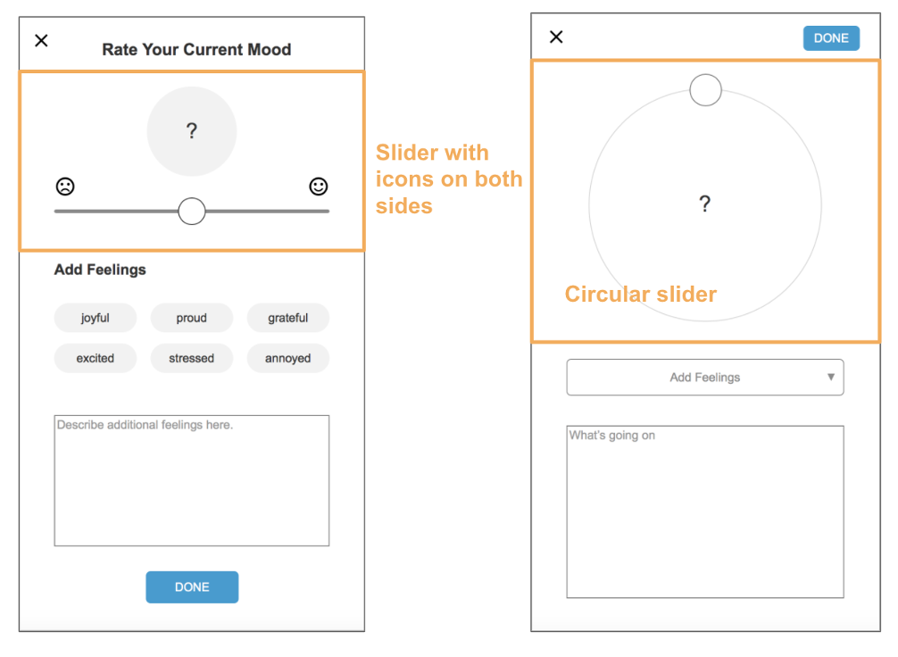
Use a straight, horizontal slider instead of the unfamiliar circular slider. Also, add permanent “smiley face” icons on both sides of the slider to help users better understand how to use the widget to rate their mood.
Left: Redesign UI ; Right: Original UI
4. Redesign the “Add Feelings” Input Widget
Severity: 2; Minor Usability Problem
Use toggle buttons for adding feelings instead of dropdown multi-select input to reduce the number of taps required to complete the task.
Lessons Learned
1. Simplify testing methods as much as possible.
Having a team of 4 using multiple testing platforms can get complicated. Simplify third-party logins, testing accounts, etc. to remain consistent. Specifically, use one test login when app experience can change per session. Ex. first time “Add a Mood” for the week vs, the rest of the times
2. No user testing tool is perfect.
Always pilot test to safeguard for system compatibility, screen size compatibility, built-in error prevention (back buttons).
3. Moderated testing is worth it.
In our unmoderated testing, we were able to collect more users, but lots of data was corrupted by users’ inattention to instructions. Having a moderator could have fixed this.


